- You have no items in your shopping cart
- Continue Shopping
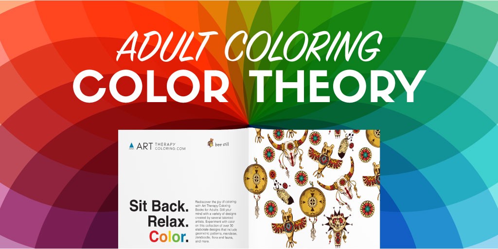
Color theory for adult coloring
The basics of color theory for adult coloring
When coloring with your stress free coloring book or any other type of adult coloring book, many people may want to learn about the basics of color theory to make their adult coloring book designs much better. Knowing what colors go good together can make your coloring book designs really stand out.
The Color Wheel
Color theory starts with the color wheel. Imagine the rainbow, and then turn it into a circle instead of a line. The color wheel has six colors: red, orange, yellow, green, blue, and purple, in that order.
There is a mathematical component to the color wheel that is easy to understand when you think about mixing paints. Red mixed with yellow makes orange, so orange goes between red and yellow. Blue mixed with yellow makes green, so green goes between blue and yellow. Red mixed with blue makes purple, so purple goes between red and blue.
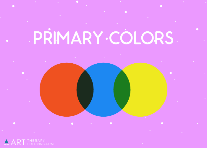
The primary colors are red, yellow, and blue. These are colors that you cannot get by mixing any other colors. If you are buying paints, you simply have to buy the primary colors. You can get by with buying only the primary colors, if you really want to.
Primary Colors:
- Red
- Yellow
- Blue
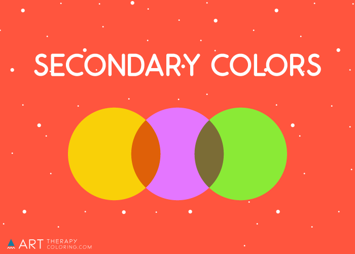
The secondary colors are purple, orange, and green. These are colors that you can get by mixing the primary colors. If you wanted to, you could go an entire painting career without buying the secondary colors. You probably wouldn’t want to, but you could.
Secondary Colors:
- Purple
- Orange
- Green
This is, of course, a simplistic way of explaining the mixing of colors, and a professional painter would probably be quick to object that different hues of both primary and secondary colors are made in different ways so it actually is important to buy the exact color you want without trying to mix it. But for the purposes of understanding color theory, this simplistic explanation gives you a valuable mental framework for comprehending how colors work.
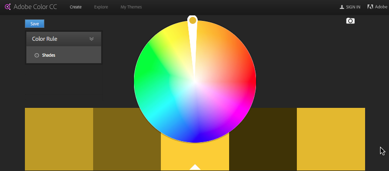
Now let’s discuss the brightness and dullness of colors. Color saturation is, basically, how much color there is. If you squeeze out some red paint from a tube, it is very saturated. It is not going to get any brighter. You can lighten it by adding white, you can darken it by adding black, or you can dull it by adding its complement, green. When you are working with colored pencils, you get greater saturation by adding layers of the same color. In common language people talk about coloring over and over the same area with the same color as darkening it, but it is actually saturating it. Darkening it would be adding some layers of black.
The shade of a color: is how much white or black is in the color. If you take blue and add white to it, you can create a spectrum of lighter shades; if you add black, you can create a spectrum of darker shades. You can do this with colored pencils on your coloring page as well, by adding layers of white or black.
The temperature of a color is an idea that varies depending on whether you are working with digital art or paint/pencils. Since we are talking about coloring pages, we will refer to the paint/pencil understanding of color temperature. Warm colors are on the orange/yellow side of the wheel, and cool colors are on the blue side of the wheel. Warm colors have an exciting effect, while cool colors have a calming effect. Individual colors can be warm or cool depending on the exact hue of the color: you can have a very warm purple that has a lot of red in it, for example, or a very cool purple that has a lot of blue in it.
There are many other things to learn about color theory as well, but this overview gives you the basic information you need to be able to plan out how to color your pages. Now let’s talk about color schemes.
Color schemes
Color schemes are how you put colors together. Now that you know the color wheel, saturation, and shade, we can move on to discussing how combinations of colors work.
Complementary colors: are colors that are opposite each other on the color wheel. These are:
- Red and green
- Purple and yellow
- Blue and orange
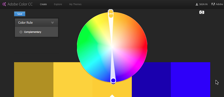
Complementary colors make the other color pop and look extremely bright when used next to each other. If you mix them, they make brown. The effect of complementary colors can be somewhat overpowering.
Split-complementary colors are like complementary colors, but on one of the sides the colors directly to either side of the complementary color are chosen. It looks like a fork in the road instead of a line straight across the color wheel. Split-complementary schemes have the energy of a complementary color scheme, but without being quite as overpowering. Some examples of split-complementary color schemes are:
- Red with yellow-green and blue-green
- Orange with blue-green and deep purple
- Yellow with magenta and indigo
- Green with magenta and red-orange
- Blue with red-orange and yellow-orange
- Purple with yellow-orange and yellow-green
Split-complementary color schemes, obviously, work on the premise that the color wheel is actually a circle-shaped spectrum, and not a wheel of separate colors.
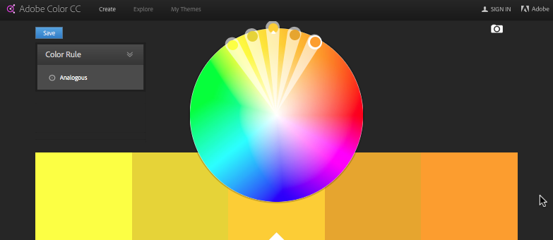
Analogous colors: are colors that are next to each other on the color wheel. The Disney film “Frozen” uses the analogous colors of blue, purple, and magenta in its color scheme. Analogous colors give a unified look that can be either bright or subdued, depending on the color temperature and the saturation you choose.
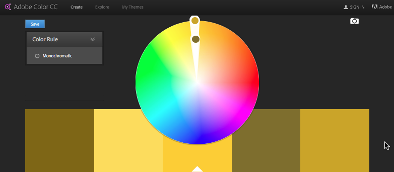
Monochromatic colors: These are color schemes that use all the same color. This might sound boring, but actually it creates a picture with interesting depth and motion, while also being pleasing to the eye. You can do a monochromatic color scheme by using, for example, all the different blues in your colored pencil set (which will give you different hues and color temperatures within your picture). Or you can select one hue and use black and white pencils to create different shades of that single hue. This is more of a challenge, but it can be quite fun and rewarding.
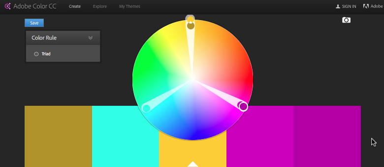
Triad colors: Triad colors are colors that are spaced on the color wheel in the shape of a triangle. They are evenly spaced and involve three colors. For example the image below shows purple, orange, and a bluish-green. Typically in designs you may use one main color that dominates the design and the other two as accents.
You can also create other color schemes by looking for patterns on the color wheel. For example, you can do a color scheme of just primary colors, which has a bright, young, elementary-school effect.
Even once you know everything there is to know about color theory, coloring is still just about playing and experimenting. But knowing about color theory gives you more tools in your toolbox to use.
If you would like to try out one of our coloring books immediately, sign up on our email list and we will send you a Free adult coloring PDF file directly to your inbox. Or buy our books now and enjoy coloring in a beautiful coloring book of your own!